Painting the inside of your house starts with a difficult choice: Just what colors are you going to use (exterior paints can also be a challenge)? If you’re not sure where to begin, we have a few suggestions for you to make sure your colors are everything you need them to be. Get your project out of the paper and get a quote for your project.

1. Start With an Existing Piece
When picking paint colors, especially interior palettes, one of the best routes to take is finding an existing piece you really, really love. This could be a piece of art, a beloved bedspread, or even a section of beautiful natural wood. You can then use this piece as a jumping off point: What colors complement the piece the most? Which match it? Which will bring out its best characteristics? You now have a number of shades to work with! If you are working with an empty house instead, look for a piece of inspiration online or in magazines that you can use in a similar way.
2. Use the Color Wheel
The color wheel is a basic tool that shows you what colors complement or contrast each other. It’s a great way to make sure that you don’t choose colors that look good in the moment, but actually clash or bring out the worst in each other. Even casual renovations or painting projects should utilize the color wheel to find effective options and avoid mistakes.
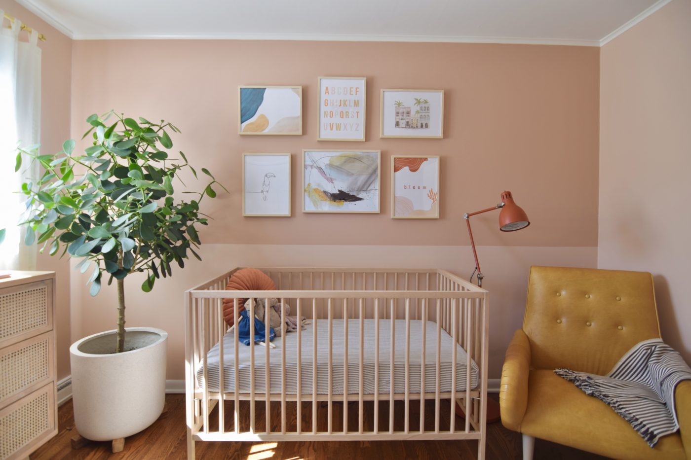
3. When in Doubt, Go Neutral
Often, neutral colors are better choices for most indoor paint colors. That’s because there are always other things to draw in the eye inside the house: Beautiful countertops, wood floors, carefully chosen furniture, murals, and so on. Neutral colors like grays, soft whites, and creamy shades will enhance these other aspects of your house without drawing too much attention to themselves. They also tend to look great with natural light!
4. Look for Easy Monochromatic Options
Monochromatic color palettes mean choosing a single base color, and then using a few different shades based off that color – some lighter, and some darker. This allows you to use darker or lighter colors in certain areas of your home while still making sure that everything matches.
5. Don’t Choose Too Many Colors
Remember, many homes already have focal points like floors or furniture to draw the eye. Choosing too many colors for your house can make it feel very cluttered, confused, and ultimately unpleasant. The eye won’t know where to look! So stick to two or possibly three colors in a particular area.
6. Pay Attention to Finishes
Remember, the right finish can add an extra dynamic to your paint colors. Usually, this means choosing a level of “sheen” from flat to high gloss. Which will work better for your home? Glossy paints tend to reflect more light, but they are also more noticeable. Different rooms may benefit from different sheens, or you could choose one sheen for the entire house.
Still having trouble making up your mind? That’s completely normal – but we can help! Call Palette Pro today and get a color consultation. We’ll go over your own needs and plans to find a color scheme that’s just right for your house.
Palette Pro. Beautifully done.