New year, new ideas, new home. If you are in the need of a change, try to change the colors of your home to have a fresh breath for the new year. We will be happy to help. Contact us to receive a free quote.
Here are the paint colors that are going to be trending this year. Deep grayish blues and purples dominate, but some warm neutrals and bold yellows are also offered up.
According with interior designer Jennifer Ott, it’s worth pointing out that homeowners are in no way expected to change the color scheme of their home with each passing color trend. Where these selections can be useful, however, is when there’s a particular color being touted that you really like. It becomes much easier to find furnishings and decorative accessories that coordinate with the favorite hue because it’s trending.
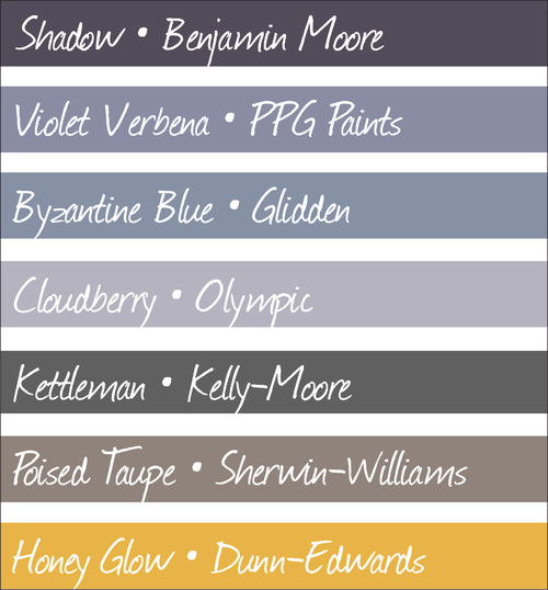
Shown above are the various 2017 paint colors of the year, from top to bottom: Shadow, from Benjamin Moore; Violet Verbena, from PPG Paints; Byzantine Blue, from Glidden; Cloudberry, from Olympic; Kettleman, from Kelly-Moore; Poised Taupe, from Sherwin-Williams; and Honey Glow, from Dunn-Edwards.
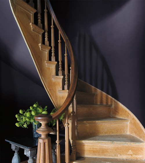
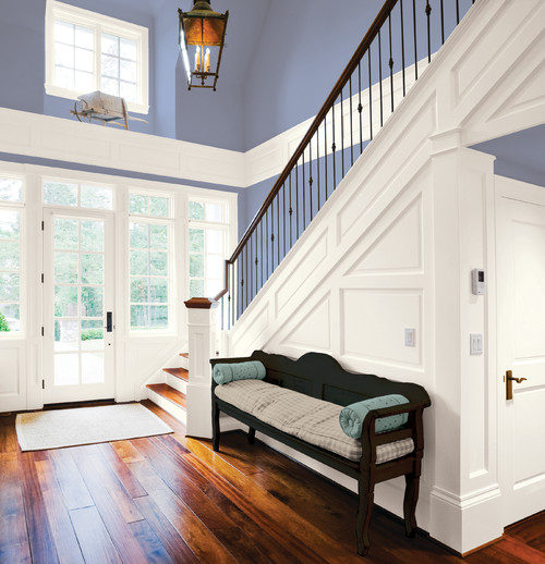
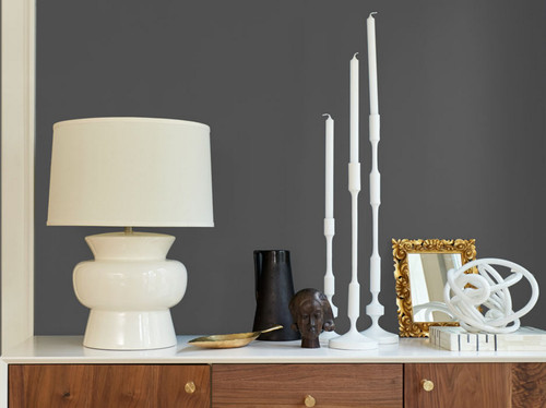
Shadow
Benjamin Moore’s selection, Shadow, is a deep, dark purple-gray hue that’s quite a shift from its 2016 choice, Simply White. I think it’s a beautiful hue, but it needs to be used with care as it can easily make a space go gloomy. Using it in small doses or in spaces we don’t tend to linger in, such as a stairway, can add a nice dash of drama to a home without bringing everyone down.
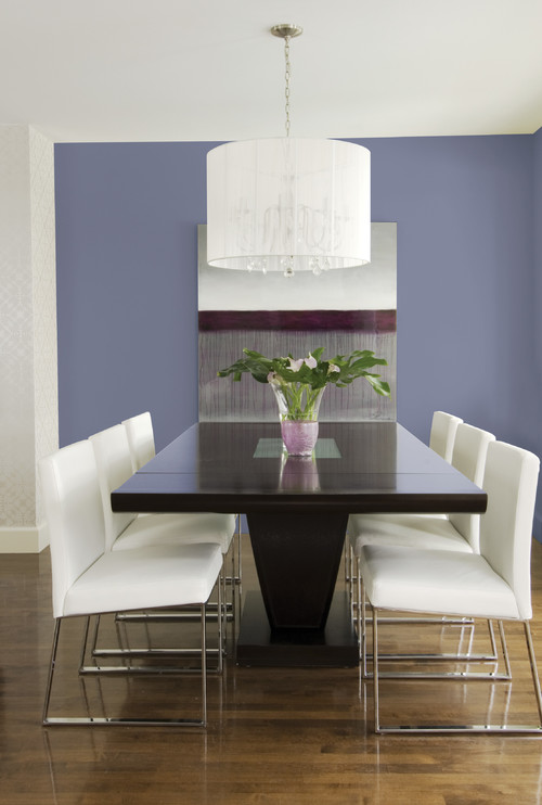
Violet Verbena
If Shadow is too shady for you, give PPG Paints’ Violet Verbena a look. It’s also a purple-gray hue but one that’s much lighter and brighter. It’s not a pastel but has a soft, soothing vibe nonetheless. I think it’s a terrific color for a bedroom or other space where a peaceful, easy feeling is desired.
Byzantine Blue
Glidden’s pick, Byzantine Blue, is also a purple-gray, but this one has a bit more blue in it than the others. It has a neutral quality due to the heavy dose of gray it has, so it works well with lots of other hues in a home.
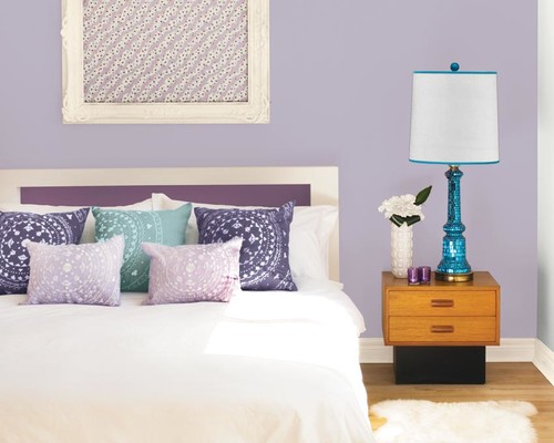
Cloudberry
Olympic goes even lighter and wispier with its selection of Cloudberry. Again, the addition of gray here keeps it from going pastel, so it’s a nice choice in a bedroom, whether it’s a kid’s room or the master suite.
Kettleman
For those who prefer strict neutral hues, Kelly-Moore is offering Kettleman as its choice for 2017. It’s a dark gray that has a touch of warmth to it, perfect for those who find true gray too chilly. Like Shadow, it’s a rather dark color, so it needs to be used in small doses or paired with plenty of contrasting light hues.
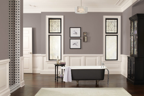
Poised Taupe
Sherwin-Williams’ choice of Poised Taupe is actually one of my go-to deep neutrals. In my color consulting business I’m seeing a bit of a homeowner revolt against the cool gray hues that have been so popular the last few years, but they aren’t exactly embracing beige again, either. Taupe — essentially a cool medium brown — is the perfect compromise between warm and cool.
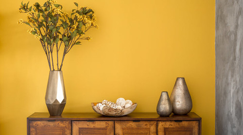
Honey Glow
Honey Glow from Dunn-Edwards is like a burst of sunshine amid the cooler, moodier hues from the others. It’s a happy, welcoming hue that works well in a kitchen, living room or on the front door.
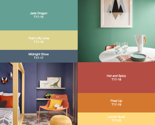
A couple of paint companies are promoting a slew of colors for 2017, rather than just one. Behr has chosen 20 hues that are divided into three categories: Comfortable, Composed and Confident. As a lover of bold color, I am most drawn to the Confident palette, shown above. Think about using these saturated colors in smaller doses, such as for an accent wall, in a niche or on the ceiling only, rather than on all four walls in a room.
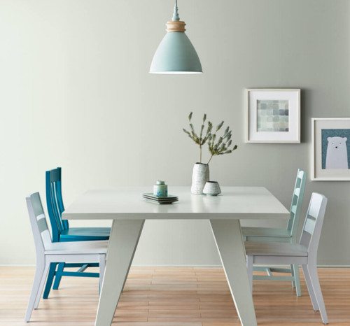
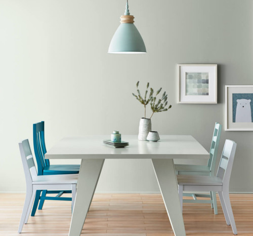
Soft Silver Sage
Valspar has put forth a mix of neutrals and bolder hues with its 12 selections for 2017’s hottest hues. One of my favorites of its neutral offerings, Soft Silver Sage, is shown.
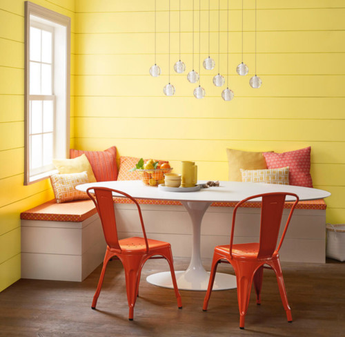
Here Comes the Sun
Among Valspar’s bolder color choices, I love the warmth and vibrancy of Here Comes the Sun, shown on the walls in the picture below.
If it’s hard for you to choose which color works best at your home, we would be happy to send our color consultant to make this selection easier.
Palette Pro. Beautifully done.